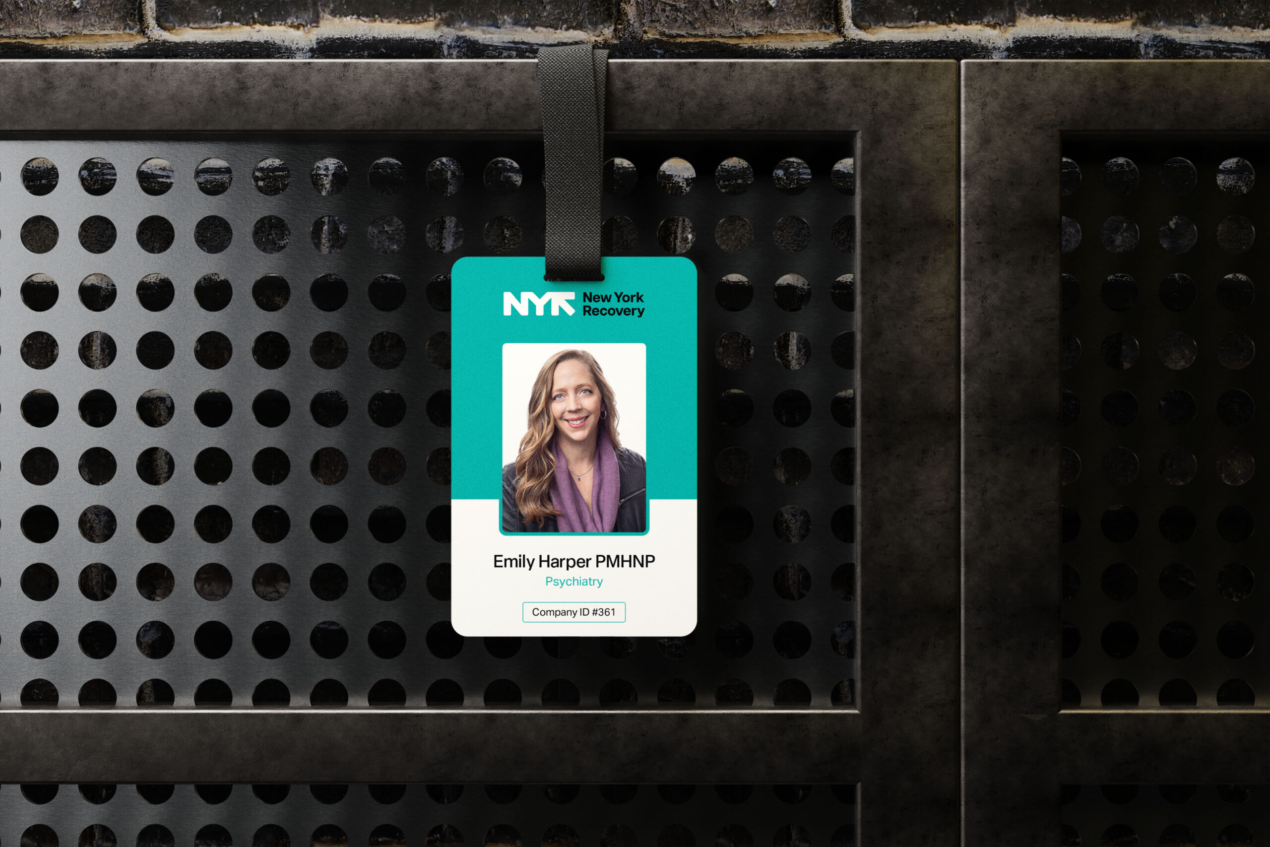
Navigating the complexities of medical supply chains can be daunting, often leaving patients and healthcare providers needing reliable support. New York Recovery recognized this challenge and aimed to deliver clarity and professionalism in the industry.
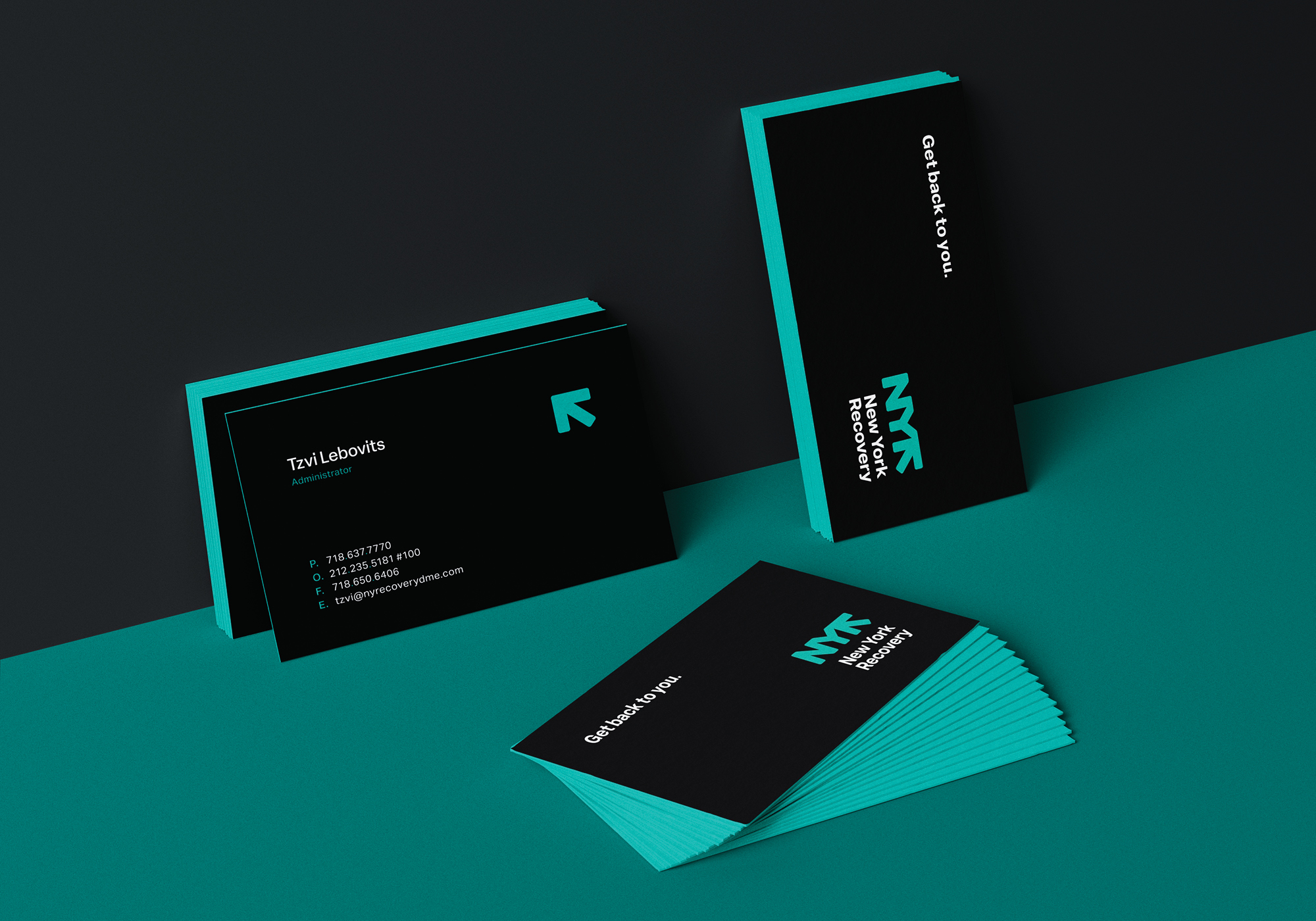
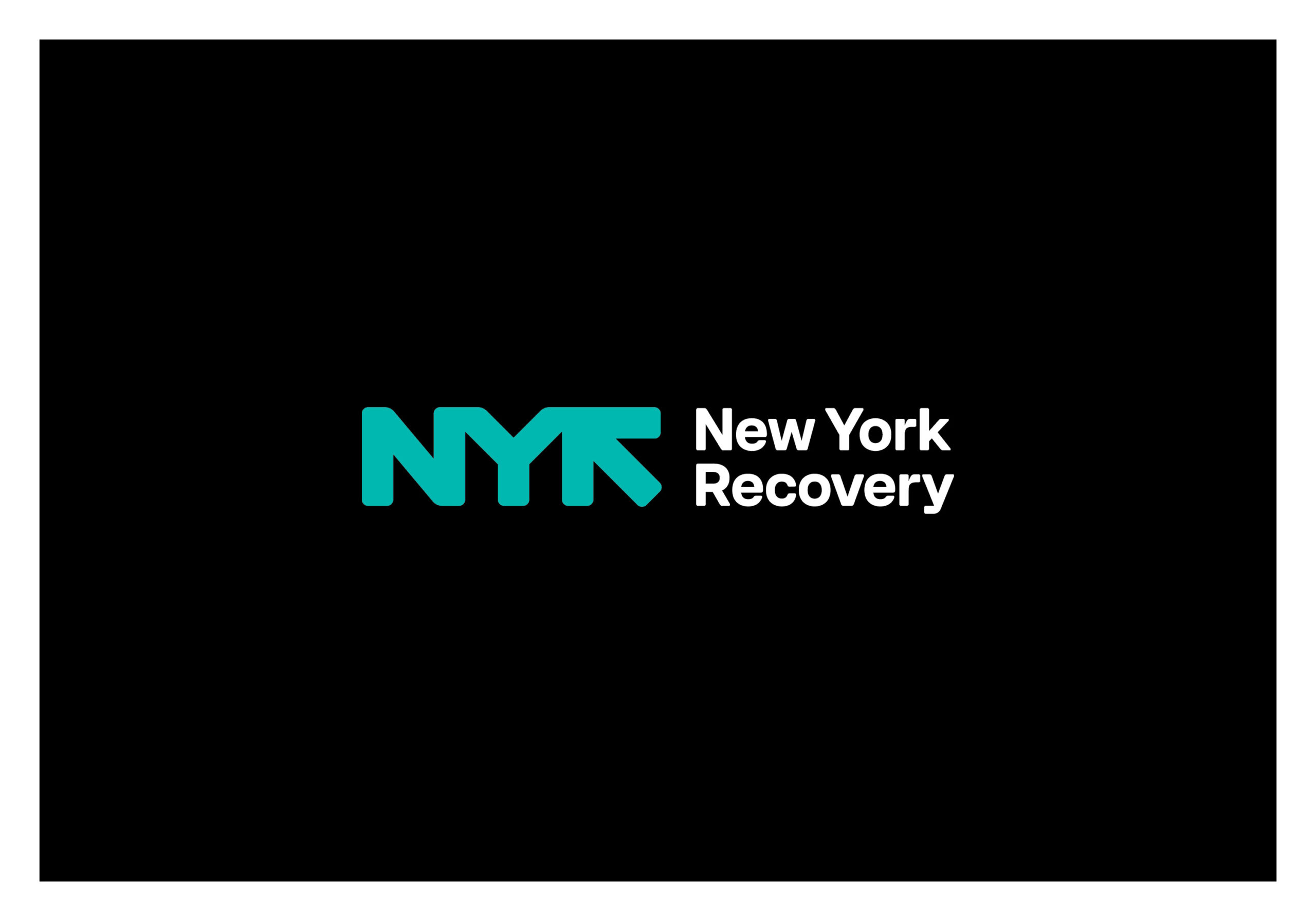
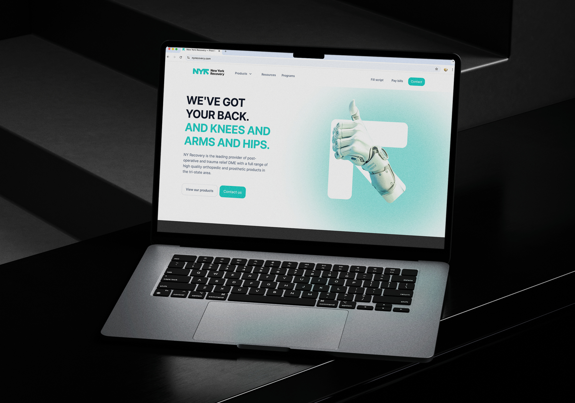
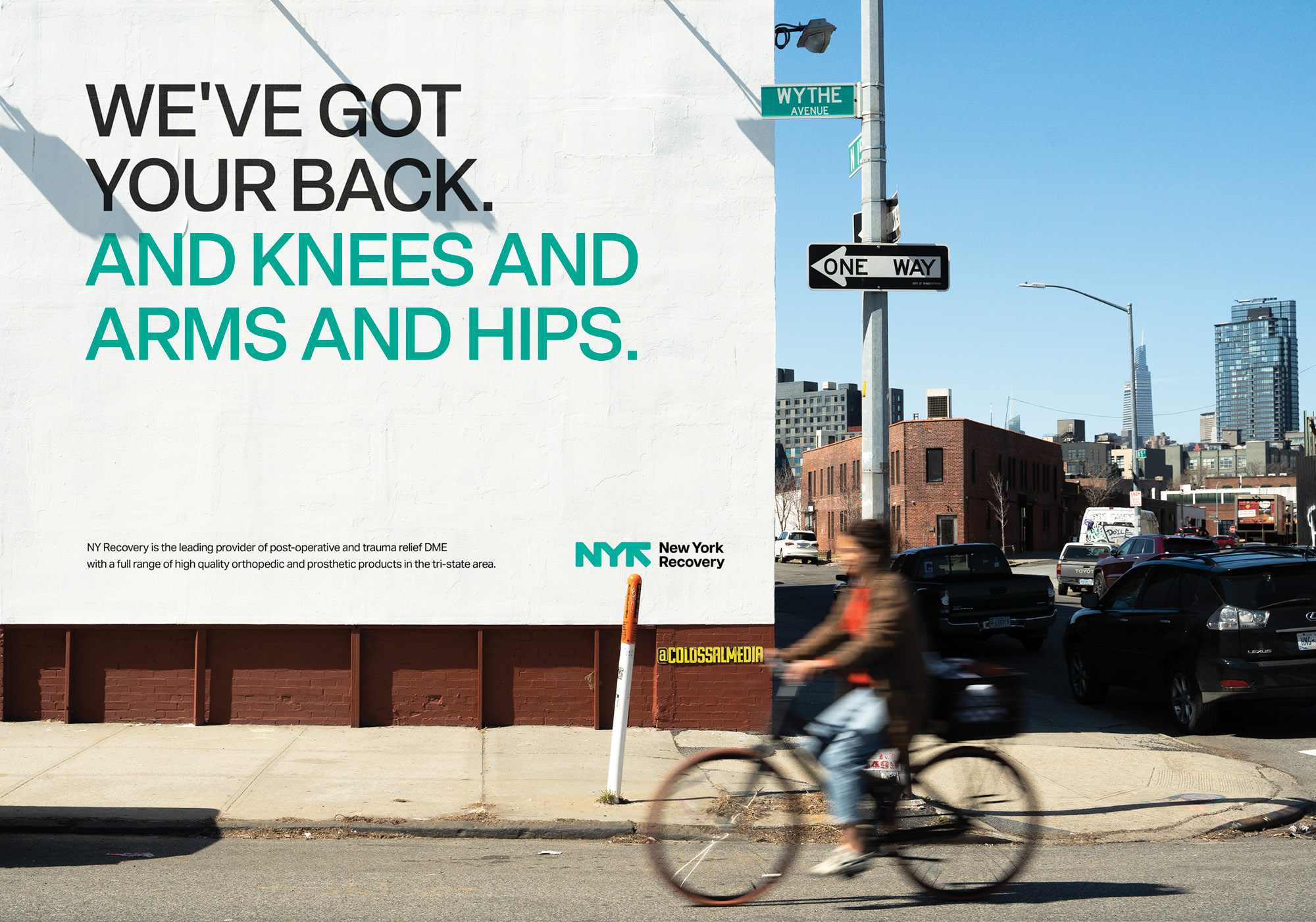
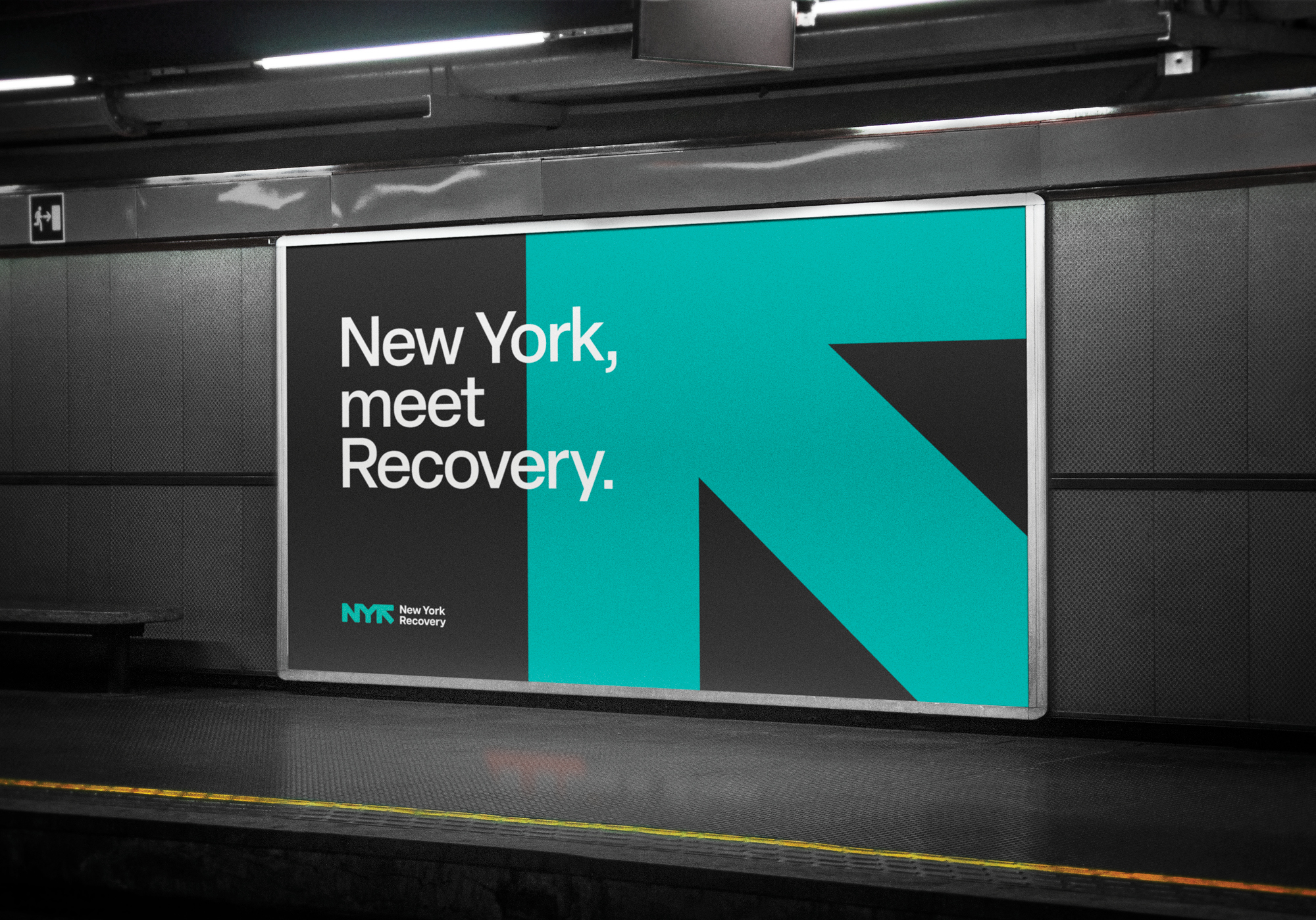
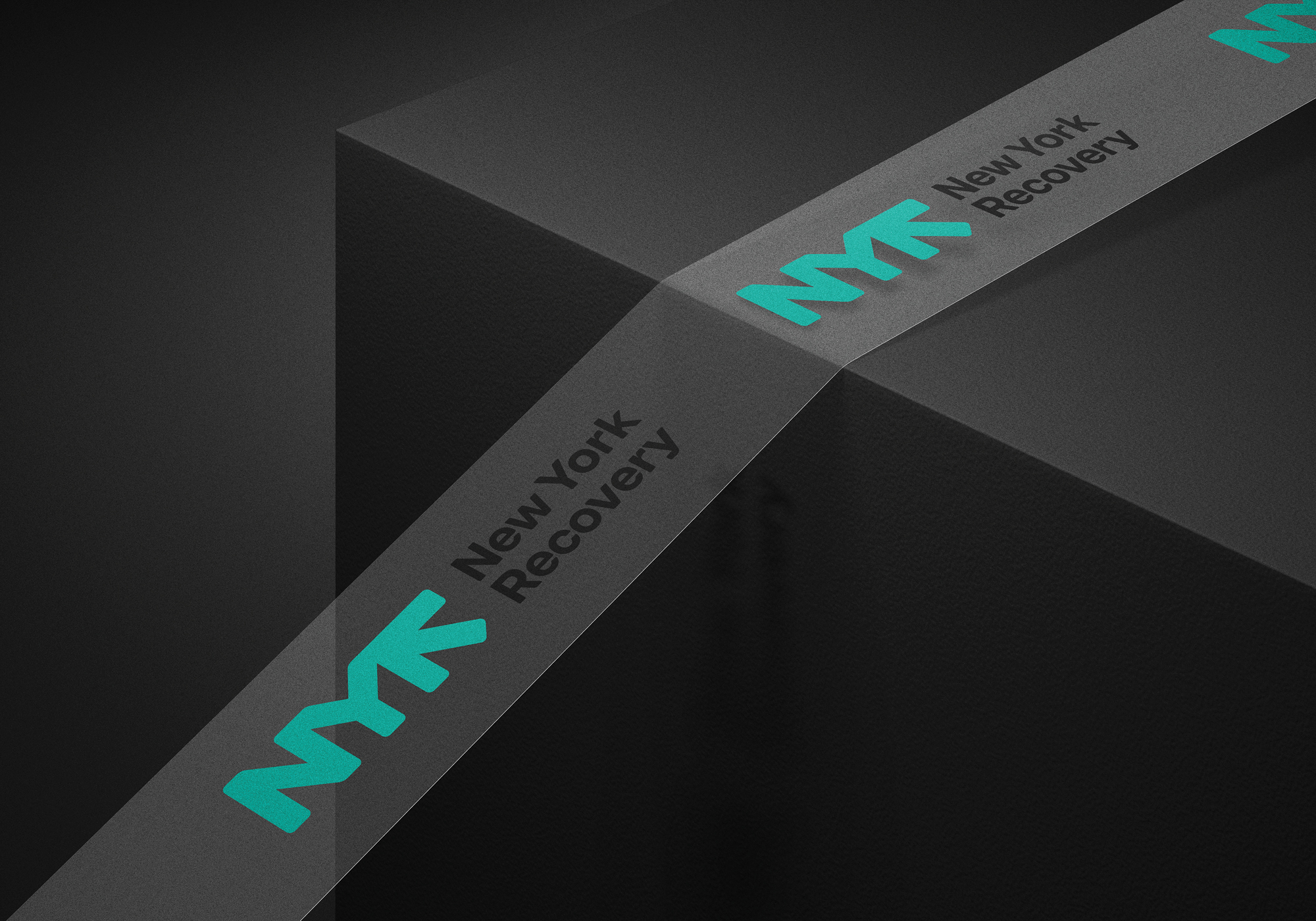
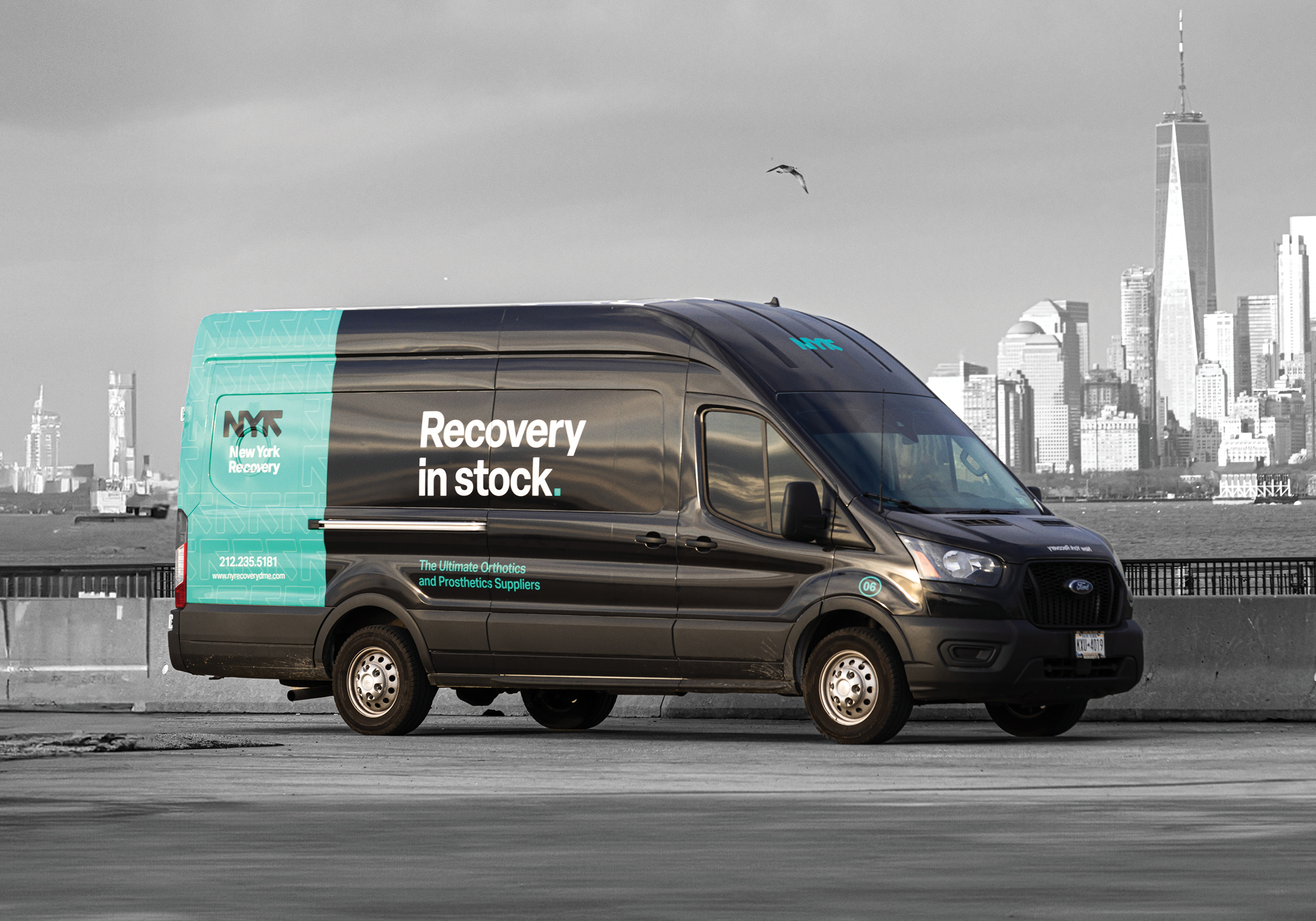
Inspired by the boldness of the NYC subway system, we created a modern identity centered around the NYR acronym, simplifying its lengthy name and enhancing brand recognition. The clean black and white palette conveys professionalism and trust, while turquoise adds a fresh modern touch, reflecting New York Recovery’s commitment to clarity and innovation.
